

Trading The Yield Curve: Pt 1
Trading The Yield Curve: Pt 1
Don't Fear the Curve. A Macro Trader's Guide


Hey guys,
I thought I’d try something new.
I’ve now added the macro snapshot, thought of the week and chart of the week to our weekly reports before we get to the main subject of each report.
That way you’ll all be able to know what we’re actively watching across the macro universe whilst giving you a bulletin-style review of the macro landscape.
The yield curve has been a topic of discussion in many rooms & calls I’ve been in recently, and it’s safe to say it’s not going anywhere anytime soon. So, I’ve dedicated today’s report to breaking down components of the yield curve and how to decipher what’s moving the curve as well as knowing what all the steepener/flattener jargon means.
As this is an intro report it’ll cover ground-level knowledge, for my advanced fixed-income readers I will have something more extensive coming up for you.
This report was for the paid subs but I decided to open it to everyone as I’ve missed a few free reports of recent…it’s been hectic guys, my bad.
This week the macro snapshot and thought of the week go hand in hand, so without further adieu, lend me your attention.
The macro snapshot & thought of the week:
The activation energy required for the Fed to cut has significantly increased. Rate cut expectations have gone from 5/6 cuts to 3, to 1 for 2024.
Disinflation, disinflation, reflation…
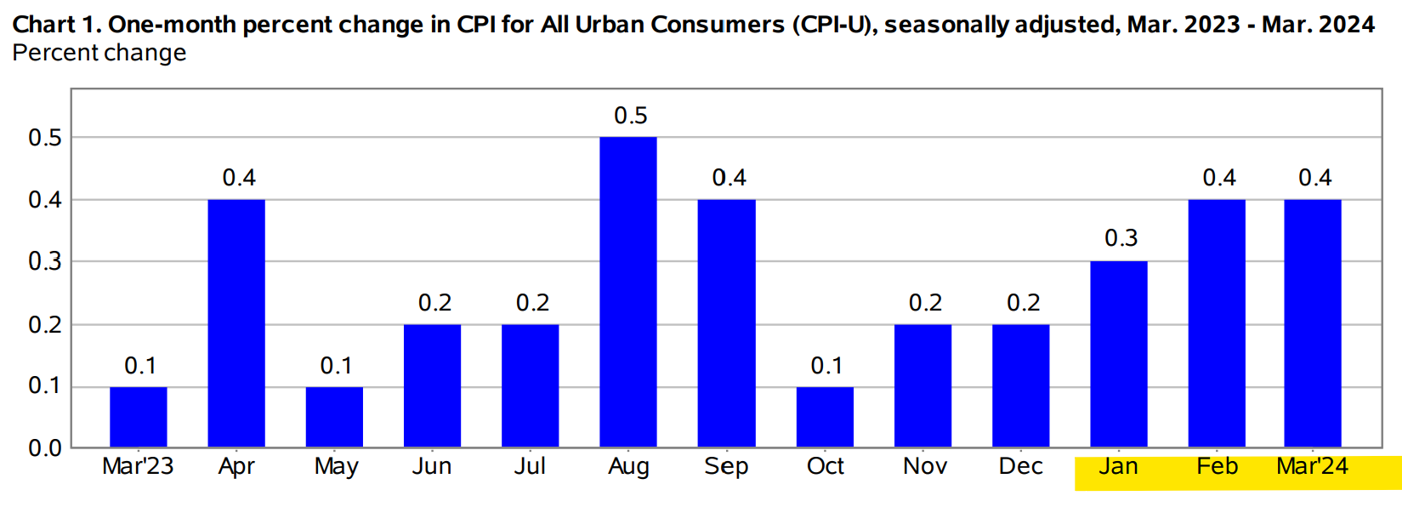
The Consumer Price Index (CPI) surprised markets for a third consecutive month, rising 0.4% in March, matching February's increase. This puts year-over-year inflation at 3.5%.
Housing and gasoline costs were the key drivers, contributing to over half of the monthly increase. The energy index rose 1.1%, while food prices remained steady despite a slight uptick in grocery prices. Core inflation (excluding volatile food and energy prices) also held at 0.4%, extending a two-month trend.
As seen below, the core CPI increase has stagnated over the last 3 months.
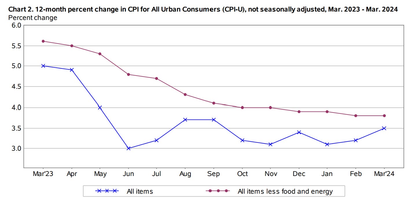
But the market has not taken this very well. There were outsized reactions across G4 FX and bonds, as traders embraced a 10-year yield of 4.5%. Option traders have also priced out a cut in Jun, and a cut for expected around September/November.
However, the Fed is keeping (more of) an eye on a key inflation measure called Supercore CPI, which excludes housing costs. In March, this measure went up by 0.7% from the previous month and 4.8% from last year, hitting its fastest pace since May 2023. A big part of this rise was due to an increase in transportation services, with car insurance premiums jumping by 2.6%. Since this indicator is largely driven by what's happening in the domestic economy, it shows that economic growth is still too strong for inflation to cool down to the Fed's goal of 2%.
In conjecture with the employment data, we suggest keeping a watchful eye on the overall inflationary trend in the US, the recent reflationary prints may not be cause to call in the bears.
Chart of the week:
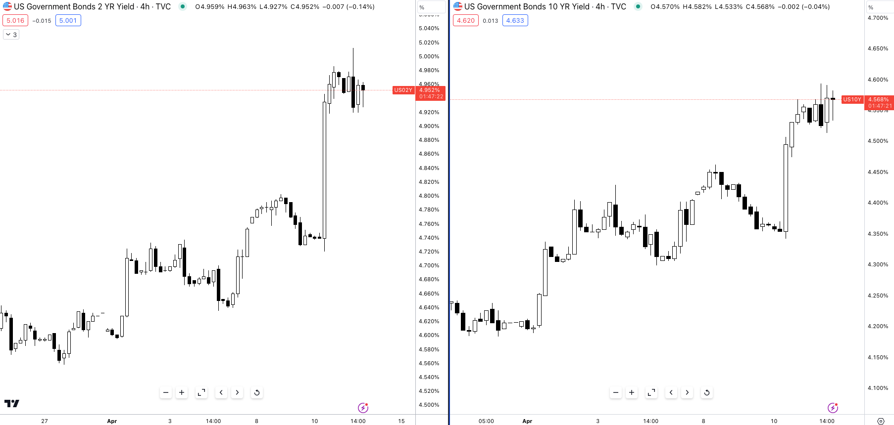
USD/JPY now trades above the 152.000 handle. A key level at which the MOF conducted its last currency intervention. JGBs are now at 0.86%, +12bps, since the start of April.
(As a rule of thumb, higher yields = bearish rates, and lower yields = bullish rates)

Understanding The Yield Curve: Pt 1
Since the inversion of the 2s10s curve in 2022, understanding the yield curve has been of great importance within macro. Being able to decipher whether the yield curve is set for a steepener or a flattener and why it’s moving towards such shape is extremely key for us “global macro traders”:
The health of the economy (from an investors’ perspective)
What the market expects future Fed policy to look like
In this piece I want to give you a fundamental understanding of the different yield curve shapes, the way the yield curve moves in response to economic and monetary developments and most importantly an idea of how to gauge potential trade ideas.
Let’s be honest.
Most if not all of us began by looking at the yield curve with absolutely no understanding of what the shape meant or why it was important. This may be the most important curve within global macro itself.
Everything from corporate to private household debt is priced using the yields on the yield curve, 30y rates influence mortgage rates, the 10y rates act as benchmark, the 1m, and 3m influence money market flows… they’re all important.
Let’s start by defining the different parts of the curve.
The front end consists of the following tenors: 0 - 2y
The belly of the curve is tenors between ~2y - 10y
Back end of the curve ~10y - 30y
Different parts of the curve are affected by different factors and economic readings, the front end (namely 2y) is highly sensitive to central bank and monetary policy decisions (rates). Whilst the belly of the curve reacts to growth and inflation expectations, and also shows what investors deem the risk/term premium to be over a given period.
We’ll get into this further either in this piece or a subsequent one, for now, let’s take a look at the normal shape of the yield curve.
The Curve Is Everything.
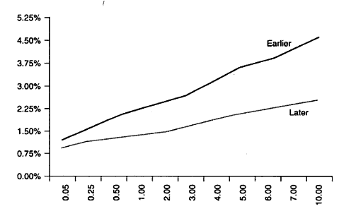
The normal shape of the yield curve means the higher the duration, the greater the yield. Why? Because investors holding onto 20y & 30y bonds are more exposed to factors like interest rate (rising/falling rates), inflation, market volatility and other inherent risks compared to the investor holding a 2y note. This is called ‘term premium’, investors are compensated for the longer duration in a normal environment.
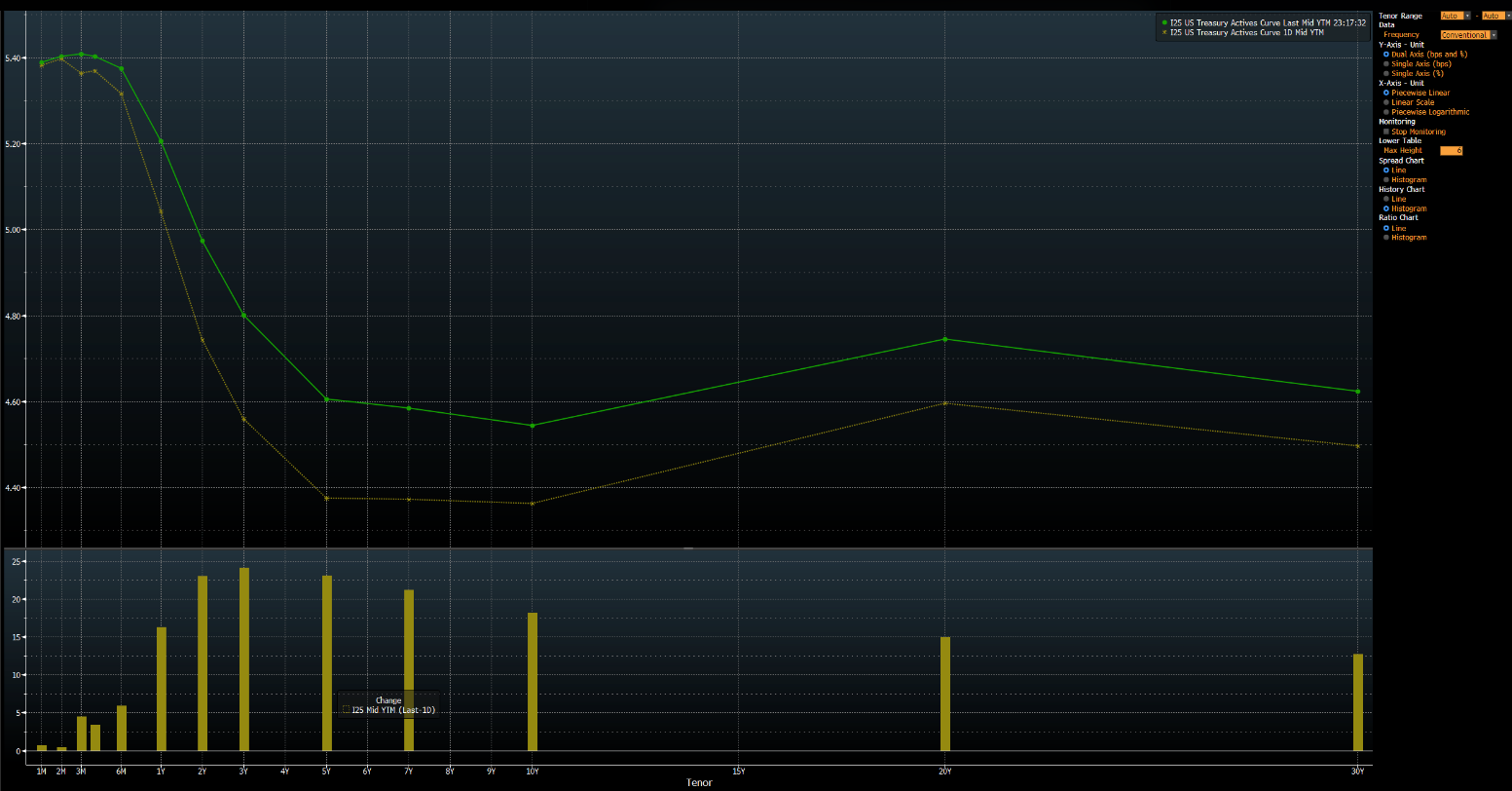
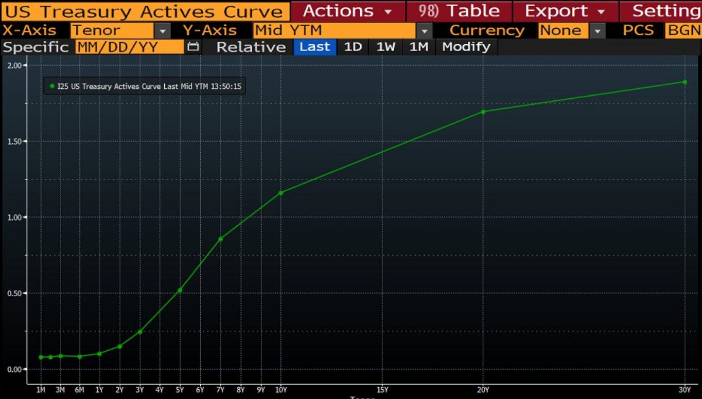
This is what the current yield curve looks like.
Let’s explain how we got here.
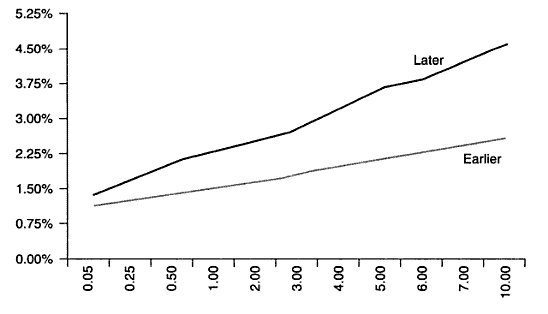
The yield curve often inverts during periods of central bank tightening, like the aggressive policy response we witnessed in 2022/23. Here's why this happens:
The Fed raises interest rates to combat unwanted inflation. Since the front end of the yield curve is most sensitive to changes in monetary policy, investor expectations come into play. As the Fed raises rates, investors anticipate future hikes, leading them to sell short-term bonds. This drives up short-term yields, causing the "front end" to rise.
The combined effect is a flattening of the yield curve. In extreme cases, when investors expect a recession it can even invert, where short-term rates exceed long-term rates.
For example, if I’m holding $1m worth of 2y notes within my bond portfolio and the central bank begins to hike rates the best thing to do would be to sell out of 2y notes; if I don’t, my existing bond portfolio will trade underwater (below par/face value), as the price of my bonds holdings will trade at a discount to match the yield of the newly issued 2y treasuries notes. The price of a bond and its yield are inversely correlated.
As this process transpires, (investors selling out of the front end) we tend to see bearish rates (higher yields) across lower duration bonds flattening the yield curve, and in some instances, depending on how bad financial markets think conditions will be, inverting the yield curve. This movement in the yield curve is called a ‘bear flattener’ because a bearish movement in front end yields (selling) has caused the front end to rally more than the belly/back end of the curve.
Understanding the different yield movements
There are four fundamental ways the yield curve can move.
Bull Flattener
We have a bull flattener, which is when the shape of the yield curve flattens due to long-term interest rates falling faster than short-term interest rates.
Bear Flattener
A bear flattener, as described above, is when short term rates rise faster than long term rates, causing the curve's shape to flatten.

Bull Steepener
A bull steepener is when short term rates decline faster than longer term rates, returning the yield curve to its normal slope. This curve move tends to happen as investors begin to price in central bank cuts in the near future, as a result, they take advantage of high short term rates shifting towards the front end which pushes yields lower.

Bear Steepener
As you may expect, a bear steepener occurs when long term rates rise faster than short term rates, usually because investors might anticipate the central bank may raise short term rates in the future to combat upcoming inflation.
It may take a minute, or a few, to really grasp the different names, shapes and reasons behind each move— for now, use this a reference point to differentiate between different yield shapes.
Recent Bear Flattener
One of the most important things in macro is not to look at charts or data from a fixed perspective but to observe the rate of change over a specific time frame. The perfect example would be analysing the YoY or MoM inflation print. One single inflation point would give you a limited view, however, if you were to look at the six-month annualised reading and analyse the trend of inflation you would be able to get a better picture.
The same applies to yields.
In order to know what the yield curve is doing and understand what it is communicating, we must first get two points along the curve across two different periods.
For this example, we’ll look at the yield curve between 2021 - 2023 year-end.

US2y yield 4/01/2021: 0.11%
US2y yield 22/12/2023: 4.325%
US10y yield 4/01/2021: 0.922%
US10y yield 22/12/2023: 3.831%
Now we want to calculate the difference between both durations (2s & 10s).
2year (new yield - previous yield) 4.325 - 0.11 = 4.215 = +421.5bps10 year (new yield - previous yield) 3.831 - 0.922 = 2.909 = +290.9bpsSo, from the start of 2021 until the end of 2023:
2 year treasuries rose roughly 421.5bps
The 10 year moved higher but only by 290.9bps
So to know whether this has been a positive or negative move in yields we subtract the 10s from the 2s.
290.9 - 421.5 = -130.6bpsMeaning that front end yields sold off more than the belly of the curve. In such an environment where the front end sells off more than the belly/back end, this is called a bear flattener since the yields moved as a result of selling.
We don’t just have to look at the yield curve on a large scale view, we can take a look at how the yield curve has shifted since the start of the month, quarter or year.
Yield curve move since 2024
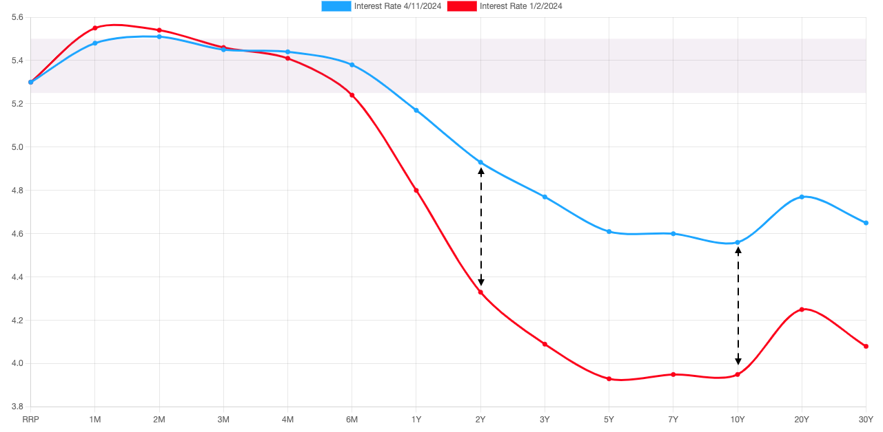
US2y yield 1/01/2024: 4.250%
US2y yield 11/04/2024: 4.952%
US10y yield 1/01/2024: 3.866%
US10y yield 11/04/2024: 4.584%
2 year (current yield - previous yield) 4.952 - 4.250 = +70.2bps10 year (current yield - previous yield) 4.584 - 3.866 = +71.8bpsClose call!
From the start of the year, it’s clear that the 10s have sold off more than the front end of the curve. A slight margin, but this still would represent a bear steepener, why? Because long yields have sold off more than front end yields.
So, to circle back, different economic conditions have different effects on the yield curve.
Fed tightening = Bear flattener
Fed easing = Bull steepener
The Rationale: These strategies primarily focus on the front end's (short-term rates) reaction to the Fed's policy changes.
Beyond the Front End: It's important to consider how long-term rates can also be influenced by other factors:
Expectation of future rate hikes = Bear steepener
Lower future inflation expectations = bull flattener
Let's delve into a specific scenario: Anticipating the Fed's continued tightening policy, we expect further selling pressure on short-term maturities, pushing their yields higher. To profit from this outlook, a bear flattener trade would be appropriate.
This strategy involves shorting the 2-year note while simultaneously going long on the 10-year treasury. Essentially, you're betting on the yield differential (the spread between the two maturities) to narrow (flatten) as short-term rates rise and potentially catch up to longer-term rates.
I’ll cap this report here to prevent me from going on and on…
It’s a joy to write for you all, I hope this report gave you an insight, or if you’re experienced acted as a good memory jog!
I’ll look to explain a recent steepener trade I was exploring prior to the inflation reading as well as deeper and more complex components of the yield curve that is essential to know.
Thoroughly enjoyed this article Joe. Been wanting to understand the mechanics of Bond markets from scratch and this article did exactly that. Waiting for Part 2